Why I should invest in data visualization?

Why Should I Invest in Data Visualization?
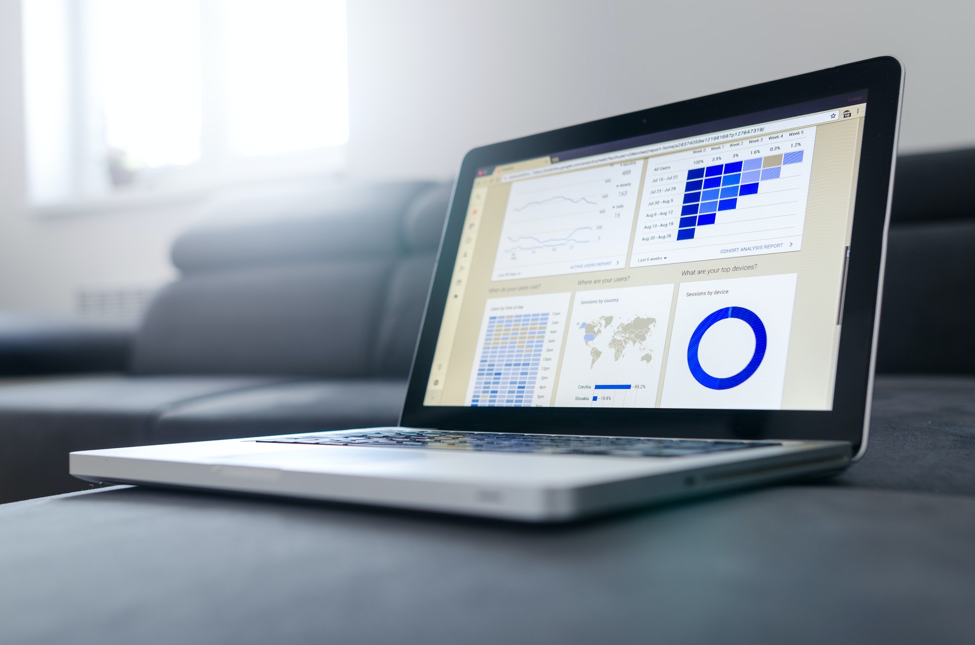
Data visualization's greatest appeal is its ability to utilize numbers to tell a story. Data science has been around for a while, continuously improving and evolving through the years. Among the biggest achievements is the incredible evolution of how to visually display this information. You might be wondering if investing in data visualization will have any meaningful impact on your business.
Data visualization can help break down giant chunks of data into useful information. It can convert them into visual representations that simplify the understanding of the data. It helps to identify insights from sales data, although the possibilities are infinite.
Data visualization is also one of the best ways to simplify and present data that would be convoluted in raw form.
There are many types of visualization formats and each of these formats has unique benefits to present data. There are also differences between data visualization tools. You will find detailed information on all these topics in the subsequent part of this article.
What Is Data Visualization?
Data has been a hot topic for a while now, and it is only getting more important. The concept of "Big Data" surfaced when data became far more complex than it used to be. Before the digital era, data was a scarce commodity. It took a lot of work to gather, record and store. That is why the ultimate quantity stayed at a level that people could understand.
After the emergence of the digital era, however, information gathering became much simpler. Now raw data is everywhere and in abundant quantities. The unstructured raw data became the basis of Big Data. It is something that requires functional expertise to be able to process & manage big data effectively.
That is where data visualization comes in. It turns raw data into visual formats such as pie charts, bar charts, heat maps, scatter plots, Gantt charts, and so on. Those formats of representing data make it easier to translate complex data and present that to other people.
Why Is Data Visualization Important?
Data is now so abundant that it’s become significantly harder to process. That makes it difficult for business owners and individuals to use it in a meaningful way. That is why data visualization became important presenting a solution to visual display data in a digestible format.
The traditional software for data storage rapidly became obsolete too. The new volume of data was too much for those old platforms to process but processing them is also important. Raw data is crucial for any business. It can help with exploratory data analysis such as high level market trends, however it also has many limitations when you want to get more granular and detailed.
Businesses that use data in their decision-making process tend to stay ahead of the competition. Humans can make sense of pictures far better than words. Consequently, transforming data to visually communicate substantial amounts of information will assure more accurate decisions on fact.

Examples Of Data Visualization Formats
The goal of data visualization is to present raw data in a visually appealing form. That form can be anything, as long as it can portray the entirety of the data set. There are many types of accepted data visual representations formats. Here is a list of some of the common visualization methods:
1. Infographics
Infographics are a broad form of data visualization. The simplified definition of infographics is almost identical to data visualization using pictures and visual cues to present data. The type of data that can be shown with infographics is also endless.
The main feature of infographics is its versatility. It incorporates every data visualization format. It has such an extensive reach in the visual aspect that you could easily explain a complex idea with it. As opposed to small line charts, an infographic can support multiple types of visualizations formats. Different formats provide different perspectives, and that is exactly what infographics do.
2. Bubble Cloud
Bubble clouds are a part of the bubble chart. The bubble charts show data with bubble shapes. Every bubble represents one type of data. And they can intersect to provide another one. Bubble clouds do not collide with the neighboring ones. They stay close like a cloud full of different pieces of information.
The most common way of implementing bubble clouds is on maps. You can think of a value and put a bubble on each state. The value determines the size of the bubble.
3. Bullet Graphs
Have you ever seen a traditional thermometer, the ones that look like rulers? A bullet graph looks almost exactly like those. But they show way more information than statistics. It is a type of bar graph that works more like a dashboard meter.
The main bar in the middle represents the primary value. That line is the feature measure. A smaller bar flows perpendicular to the feature measure called the Target Marker.
In most cases, people use the target marker to show the goal or target. The feature measure or the middle bar represents what you managed to achieve. These charts also have segmented color shades around the main bar.
4. Heatmap
Heatmap is one of the most effective charts for representing data out there. It transforms data in a color-coded format, something most people can understand. Visual representations allow people to understand the data much faster than numbers.
The best use of heatmap is for tracking records. That can be any record over any time. For example, you could make a heatmap to record employee attendance. It can show who missed, who came in late, and who came on time, and how many times they did that.
It may sound basic, but you can glean a lot more information from them by seeing a side-by-side comparison. Another common usage of heatmap is the stock market. It allows you to easily put all the price ranges throughout a year on a heatmap. That can give valuable insight into when the prices tend to fall or go up.
5. Fever charts
Fever chart is one of the most ingenious formats to visually communicate in project management. Its primary usage lies in showing changing data. The subject of any data can change over time, and few charts can capture the change accurately. The Fever chart happens to be one of those few.
Fever charts have a wide range of applications. It can show the changes in profit, sales and other things of the past month or year. It is a very effective chart for identifying behavioral changes in consumers, due to its ability to record data points and timed changes. For this reason, this chart is often called the time series chart.
Best Data Visualization Software
The quality of the data visualization tools often varies quite significantly n the market, they are not all created equal. That is why you should be very careful while buying a data visualization tool. Here are some of the best tools on the market right now:
❯ Tableau
Tableau is a close competitor to Microsoft Power BI. It is a tool that enables complete novices to make data visuals without any outside help. It is one of the fastest data visualization software out there, and it offers a lightweight experience.
Tableau can analyze countless raw data and give a formatted visual within seconds. In terms of speed, it even beats Microsoft Power BI. It is also easy to use and does not require so much input.
It has a stunning dashboard and many charts to work with. The infographic dashboard is in an interactive format. So, the overall quality of the visualization is much easier to comprehend. It does lack predictive analytic capabilities though.
Features
Online Database: Tableau has an online data server of its own. The data warehouse acts as a cloud platform that connects to every user. Meaning you have access to all types of data at any given moment.
Data Sharing: The data sharing feature allows you to share data with your associates. This feature greatly improves communication, and ultimately gives a faster response time.
Pros
• Fast Analysis
• Lightweight Program
Cons
• Limited Predictive Capabilities
❯ Microsoft Power BI
Power BI is a reliable data visualization tool from Microsoft. The tool has optimized data preparation formats that anyone can use. The interface is easy to navigate for most people.
It is also a work in progress. Meaning Microsoft keeps updating it with new features and formats. Some of the features are amazing, while others are average. But the point is, they have an active development team working to make it better.
It is common to see Power BI is used for the management of analytics. It provides data insights in many formats, but it does require a decent amount of data analysts' input. The lack of automated features is its only downside. But we can expect to see the inclusion of such features in future updates.
Features
Data Source Connectivity: Power BI comes with a Get Data feature. It lets the users browse through an extensive data archive. These data sources come in all shapes and sizes.
You could find both structured and unstructured archives here. The best part is that they keep updating the database regularly.
DAX Functions: The Dax functions are a type of data analytic tool. These tools work based on existing codes to complete specific data analytics tasks.
There are close to two hundred DAX functions on the current Power BI, and the creators plan to add more in the future.
Pros
• Smooth Interface
• Accurate Analysis
• Many Formats
Cons
• High Learning Curve
❯ Qlik Sense
Qlik Sense is a dynamic data visualization software from Qlik. It offers fast data visualization and a user-friendly interface. Qlik has a lot of math-related software, and the company is well-known for its accuracy.
Qlik Sense does not offer too many customizations. There's another app from Qlik called the 'Qlik view' that handles that part. The Qlik sense is all about making simplified chart types of the data you want. It also has an interactive self-service dashboard and sharing feature.
It's simple software, but it does everything a non-technical user needs. There's almost zero learning curve, and you get the information fast.
Features
Self-service Visualization: Self-service visualization uses the QIX engine to its max capacity. The feature allows you to combine any data from any source.
Smart Searching: The smart search feature lets you exclude irrelevant data. You can cherry-pick what you want from the data archive. It helps search faster and more concisely.
Pros
• Lightweight Engine
• Predictive Features
• Active analytics
Cons
• Lack Of Format Options
Data Visualization and Big Data for CPG
CPG (Consumers Packaged Goods), one of the largest sectors lead by established companies comprised of millions of SKUs, driven by innovation, price, promotion, and distribution. Over the years CPG data has become more intensive, not only with point-of-sale data, by store by SKU, but also in the understanding of the consumer and their shopping habits, especially now with the increase engagement to On-Line. Analyticsmart leverages Big Data (millions of rows of data) to form quantitative information in a simplified format (Data Visualization). Currently, CPG companies using interactive data receives a more accurate business analysis to identify key areas of influence and strategies to support business growth in a more efficient manner.
Final Thoughts
Data visualization has completely changed the way businesses look at data. Currently, the idea illustration and idea generation process are intrinsically dependent on data variables and inputs. This transformed data not only into a visual object but into a tool to facilitate communication. The variety of representations of data allows transforming complex data into simpler charts (i.e., bar charts and pie charts). However, in order to have a coordinated system that permits your business to gather and clean the data to transform that into actionable insights, technical resources and expertise will be needed. The process is usually complex and requires technological sophistication, especially to store the data.
Analyticsmart has many years of experience in data visualization services. Our experts can provide the best-in-class solutions to help your business thrive.
Click here to learn more about how Analyticsmart can help you with Data visualization.
Disclaimer

At Analyticsmart our mission is to translate data into meaningful, measurable and actionable insights that drive growth and increase profitability for your business. We provide smart analytical services and solutions that are tailored to your specific business needs and are easy to implement.
Recent Posts

Why are Category Resets so *dang hard?
First let’s review what a Category Reset is:
A category reset, sometimes known as a merchandising reset, or a re-align is the process of rearranging the products in store (on shelf /on disp ...
Curated Careers at Analyticsmart
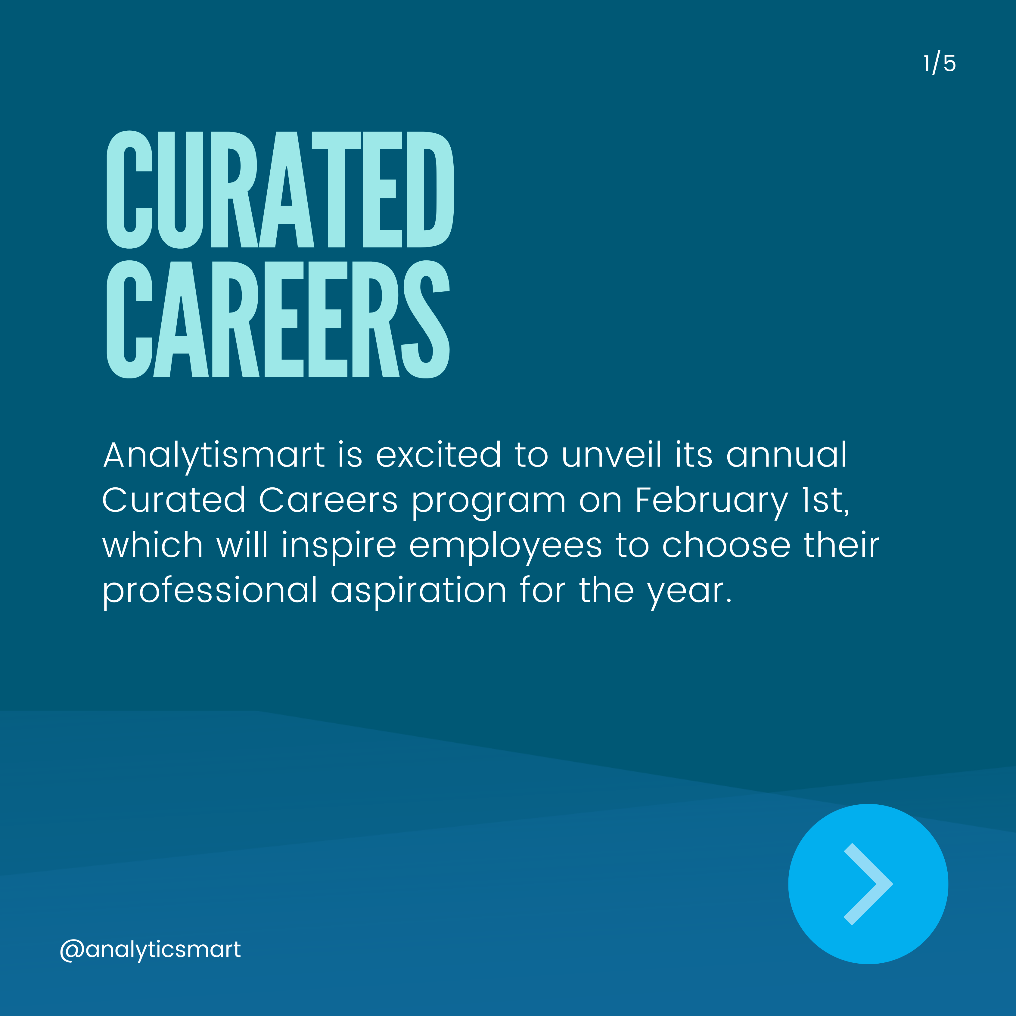
Curated careers refer to career paths that have been intentionally designed and customized to align with an individual's strengths, interests, values, and goals. Unlike traditional career paths tha ...

What is a planogram and how is it used?
1. What is a planogram?
A Planogram is a space planning tool. Planograms are a comprehensive representation of a retail shelf focusing on the product level, this visua ...

Join Our Community For Exclusive Offers
& Updates On Our Latest Technology!

Analyticsmart